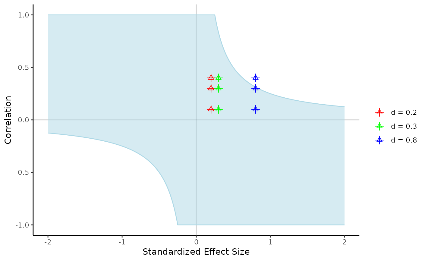
Visualization for Estimating c Bias + Estimates
visualize_c_map.RdThis function displays a visualization of the possible bias c that allows for a non-zero effect in sensitivity. This function includes the ability to add values of effect size and correlation to see how they map onto the proposed c value.
Usage
visualize_c_map(
  dlow,
  r_values,
  d_values = NULL,
  f_values = NULL,
  f2_values = NULL,
  nnt_values = NULL,
  prob_values = NULL,
  prop_u1_values = NULL,
  prop_u2_values = NULL,
  prop_u3_values = NULL,
  prop_overlap_values = NULL,
  point_colors = c("red", "green", "blue"),
  size = 2,
  shape_1 = 2,
  shape_2 = 3,
  ribbon_color = "lightblue",
  lower = TRUE
)
Arguments
- dlow
The lower limit of the possible effect size (required).
- r_values
A vector of correlation values that are possible (required).
- d_values
A vector of effect size values that are possible.
- f_values
A vector of f effect size values that are possible.
- f2_values
A vector of f2 effect size values that are possible.
- nnt_values
A vector of number needed to treat effect size values that are possible.
- prob_values
A vector of probability of superiority effect size values that are possible.
- prop_u1_values
A vector of proportion of overlap u1 effect size values that are possible.
- prop_u2_values
A vector of proportion of overlap u2 effect size values that are possible.
- prop_u3_values
A vector of proportion of overlap u3 effect size values that are possible.
- prop_overlap_values
A vector of proportion of distribution overlap effect size values that are possible.
- point_colors
A vector of color names or codes to plot the effect sizes on the graph. You should use as many color names/codes as you have max of an effect size (i.e, if r has 4, d has 3, and prob has 5, then use 5 as the max number of colors).
- size
The size of the symbols on the chart.
- shape_1
a numeric value of one of the ggplot2 shapes
- shape_2
a numeric value of one of the ggplot2 shapes - if you use different numbers, the two shapes are overlaid, as we found this effect made it easier to read with many effect sizes plotted on the same graph.
- ribbon_color
a color name or code to shade the area that shows a non-zero effect in sensitivity.
- lower
Use this to indicate if you want the lower or upper bound of d for one sided confidence intervals. If d is positive, you generally want
lower = TRUE, while negative d values should enterlower = FALSEfor the upper bound that is closer to zero (required).
